My website is overdue for a redesign and a big update and in about 2 weeks the new one should be up.
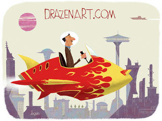
Thought I would post the new home page.
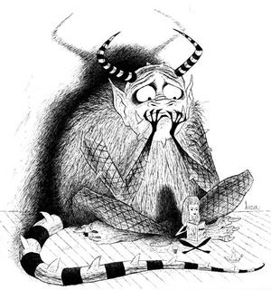
As well heres a doodle that I developed a bit further. Still playing around with possible colour combinations tho
I think in this state the simpler the colour the better and probably b and w. i might do a more rendered colour version if I get the time.


2 comments:
Goodness gracious! More gorgeous art! Not sure which one I like more...but since they're so different, maybe I won't choose a favorite. Not only are you very GOOD at what you do, you're very prolific too!
Love the rocketeer, particularly the flamejob and the cityscape. I quite rather like the monster too, he doesn't need any color imo. Your stuff's too good, you need to stop before you make the rest of us look bad :p
Post a Comment