I don't usually post work related stuff unless its more personal to what I'm doing even tho all work is personal to some degree


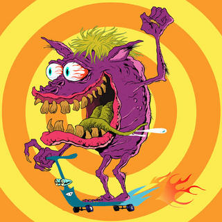
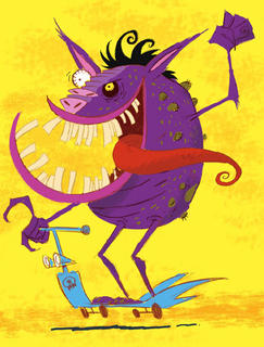
as you invest a certain amount of yourself in it and try to and do the best job you can, but I thought I would post some game character designs I did earliar in the year for a toy company anyway . The company asked me for something different than my usual style and I submitted two pieces and they chose the first [tho I was hoping for the second the first is more what they were looking for.
I am a fan of BIg Daddy Roth and Wally Woods wacky sixties monster cards so it was fun to dip into those waters again.
The monsters would be produced very small on stickers for pieces of the game and so with that I in mind I designed them fairly simply. I ended up redoing and colouring them formyself which I might post some other time.
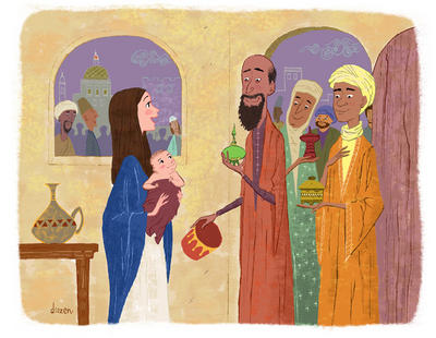
And even tho its October just so its not all about the monsters I'll post this illustration I did for teen magazine a while back on a story about the Maji and Baby Jesus.


12 comments:
Hi Drazen! Great monsters. Definately prefer the second one.
I like your take on the Maji and Baby J too. Mary has a youthful feel that you often don't see in traditional illustrations on this subject. -Arna
Like the doodlers, I prefer the second as well! Looking forward to seeing more of your monsters!
Mary has such a great look of joy on her expression! You captured it beautifully!
As always, wonderful work, DRAZ!
Mr. Dot
yep its always a drag when you prefer the second and they pick the first. The client wanted more the look of the first
but I tried to throw them something closer to what I wanted to do but no go.
No such situation with the Maji piece.
Great stuff. i like seeing all of it. The second monster guy actually reminds me a bit of my uncle.
sorry...i don't have a blog! so, i'm trying to be all sneaky, anonymity and all... but i wanted to ask...how do you achieve your painterly looks? is it paint and brush...or photoshop and wacom tablet?
i mean i'm NOT trying to be all sneaky! lol! ...sorry!
Love the Wise Men piece, Drazen. The various expressions make me feel warm and tingly.
I'm going with the second one too. It's more drazeny or drazenish or whatever it is that your stuff has. The Maji piece is great too. It's draztastic!
thanks guy and guys and gals. The first piece isn't really my style but was done as a guide. Other folks ended up cleaning up my designs following a less detailed version of that one. Its not something I would post on my website but I figured I got this blog so why not. The ones
I cleaned up for myself [not here] are more what I like to do.
Glad you like the Maji piece, thats all me.
and as for you sneaky anonymous...its photoshop but I paint traditionally as well so I like to think that helps.
Definitely the second one. Great design.
I love both the scary and saintly theme illustrations!! Both have great characters design ... love the color a lot. Though I have to say I like the free line illustration of the monster better then the clearer version on top. :) Great works!
you realize how painful it is too hear everyone agrees with me and want the second [more me] version but having the end result look more like the first but thanks,"sob", anyway. I shouldn't have even posted the first ..ah well.:-)
Post a Comment